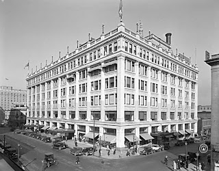
A few weeks ago I stumbled across this picture that was taken in the 1930s/40s of the Hudson's Bay Company building (The Bay) here in Vancouver. I love old photos and historical architecture in general, but this picture struck me. It struck me because of how much the building had been butchered and defaced by poor design decisions in the time since. To compare, look at a picture from a similar angle taken today:

All the upper windows have been covered over. One column of windows has been transformed into ventilation grilles (which are dirty, of course).
 The awnings over each street-level window and the large canopies over each entrance have been replaced by an ugly, oppressive overhang. Sure, the overhang is great for protection from the rain, but it's dark and uninviting beneath. Without the entrance canopies, who can tell where to enter the store unless you're walking right in front?
The light standards that used to line the parapet are gone. Even the signage is bad - a suburban fluorescent sign-box on the corner of the building.
These pictures taken at night also show the contrast between then and now:


 The modern exterior lighting treatment is pretty great, I must admit. But the windows, the eyes of any building, are dead and lifeless. In the old photo, the building has a life, a soul, it's a place you might actually want to enter.
Fortunately modern architects have realized past mistakes such as this. Natural light has made a comeback, windows are a must, and they even open! The street-scape and pedestrian environment are key elements of any new building design today, much as they were when The Bay was originally built. I guess this post is an attempt to convince "the powers that be" to bring back the character of the original building, which is arguably one of the most beautiful in this concrete and glass city.


No comments:
Post a Comment